I was recently asked how a designer can make sure the colors on the screen and the colors on the printer are the same. The hard and short answer is a glowing screen and a printed piece of paper will never look quite the same. They are two different mediums. If you look around you on a typical day, you will also notice lit up signage, billboards, vehicles, packaging, and clothing. Many of those are also produced using a color match system. If you take one color, even a color system matched color, it will not look exactly the same to the naked eye across difference materials.
A computer screen can display millions of colors, many of which cannot be reproduced by a printer. Until recently, this was also an issue in web design, where colors would be way different from monitor to monitor. Advances in video cards and other physical components of computers as well as software in browsers have made that largely not an issue anymore. Which is a good thing because oh my god the color options we had then.
What is Color Theory?
It is a scientific theory about where color comes from and how it is classified and defined. It is a system for creatives to use when choosing color. There is a lot more too it, books and books worth, that we will talk about next time in more detail.
What Color Theory Isn’t
It does not keep you from screwing up screen to print colors. It doesn’t tell you whether a color will be the right choice for you or how many or which ones to pick. It is more like a framework for you to use to create your own guidelines to follow. While you can use different color rules such as triad and compound to choose colors, you may find yourself frustrated that you keep picking the same ones after a while.

Okay, you say, that’s great and all but I still have a problem. How do I get this client piece to match on screen and printed as closely as possible?. Depending how critical the color match is, there are a couple of ways to go about this.
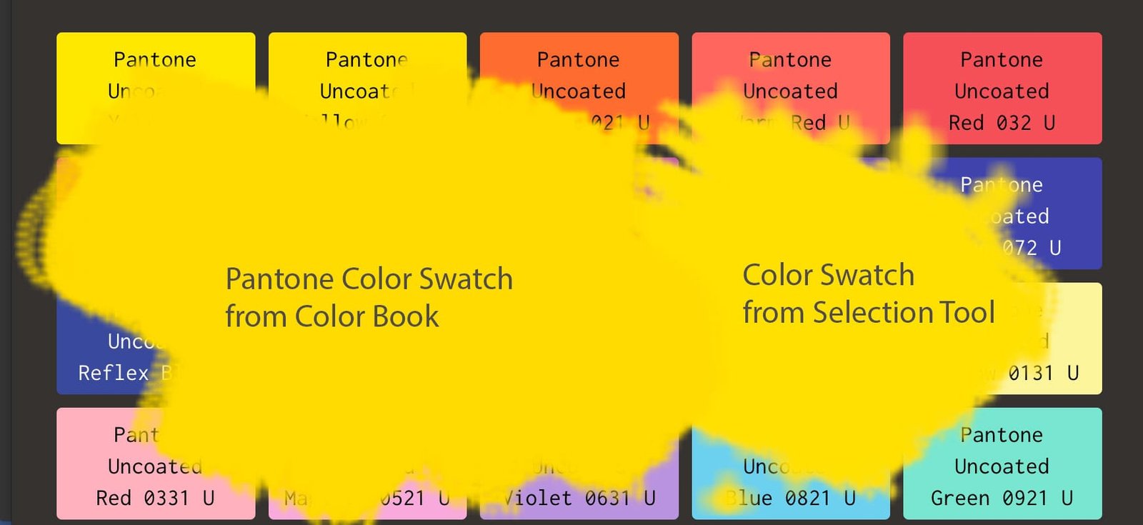
Color Matching Comparison – Color Systems vs. Eyedropper Mayhem
Let’s take a look at a common situation by pulling up a screen grab I made showing a color swatch chosen from a digital Pantone swatch book versus one from the eyedropper tool in PhotoShop. I used PMS 012 U, from the uncoated color book.

When we compare them side by side, we can quickly see the Pantone system color is a bit darker, though they are both in the top area of the digital preview window. The Pantone swatch is darker, even though I made the eyedropper swatch from a screen grab of a Pantone swatch. They have almost the same amount of red. The Pantone swatch has almost half the amount of blue the eyedropper swatch does. This is a significant difference, one you will notice if you print them both out side by side. The Pantone System color has an out of gamut warning, which could make things interesting depending on the color specification settings when you output the file locally instead of with a professional printer. Remember to also check the color mode you are in when looking at differences in color settings for a file.
Pantone Color Matching
Pantone colors are the industry standard. Not just for graphic design but for fashion and just about any other industry that uses color. How it works is Pantone has identified precise mixtures to achieve a set range of colors and have them be accurately represented across multiple materials, from Sintra board to cloth to paper to computer screens. Even if you computer is not properly color calibrated, using pantone spot colors will ensure the printer’s system (or your own printer devices) interpret the colors and reproduce them correctly no matter what appears to be on your screen.
If you use Adobe products, you have free color book palettes to choose from. You can also dial in the colors manually and then specify them to a printer. This works best for jobs with only a few colors. We explored some different tools last episode to help you choose a palette. You next need to make sure the colors will print properly. Some blues tend to purple for example. This is why taking your palette then matching those colors to a color book is the easiest way to insure the results you want. You can use a tool like RGB.to pretty reliably if you have no budget. (Note: as of this post their website is down, so you may want to use the free Adobe Color CC tool instead). I have tested it against existing swatch books and it does very some, but often only by a little bit. I still recommend working with a professional printer when color matching is critical for a job.
Pantone book sets are expensive. When purchasing a physical Pantone color book set, I recommend solid coated and solid uncoated books. You just need two swatch books to start. If you do any client work or work in-house it will save you a lot of time and get you exploring away from the computer. You can line up multiple colors against each other to see how they work together.
Next time we will cover color specifications and tips to using the right ones for the job. We will also go into more detail about RGB vs. CMYK.
I will leave you today with a few tips:
- RGB vs. CMYK is light vs. physical pigment
- Calibrate your screen. Most computers have a color calibration tool built in. PC Mag has an tutorial on page 2 of this article that goes over the basics. Apple also has several depending on your version of OS.
- Check your color mode. Try to always convert from RGB to CMYK.
- Be careful of your screen lightness settings after calibrarion
- compare printed pieces to pantone color swatches
- There are physical tools like Color Munki, but I think they are more useful for designers who deal in environmental, interior or fashion design. One advantage is they give you an easy, sharable device to use for monitor calibration your whole team can use.
- A good printer will save you money by being able to proof your printed materials against pantone for you and help you avoid horrible color mistakes by checking your palette and doing live color adjustment. They can also teach you a lot through press checks. Seeing color adjustment on the fly is pretty cool.
What are your biggest struggles with understanding color theory?
[…] http://leesjordanstudio.com/secrets-to-color-matching-monitors-and-printers/ […]