I’ve put together five tips for creating better color palettes based on a recent talk I gave to computer science students. Faced with working on their first mobile apps or sites, they had never really been given advice on choosing color palettes. I realized this is one of those gaps in knowledge; part of the missing manual of design experience you build over time as a developer or designer. I hope you find them useful too.
- A web palette can have as few as three colors, but five is ideal so you have a very dark, a very light, an action color and another for background or quieter emphasis.
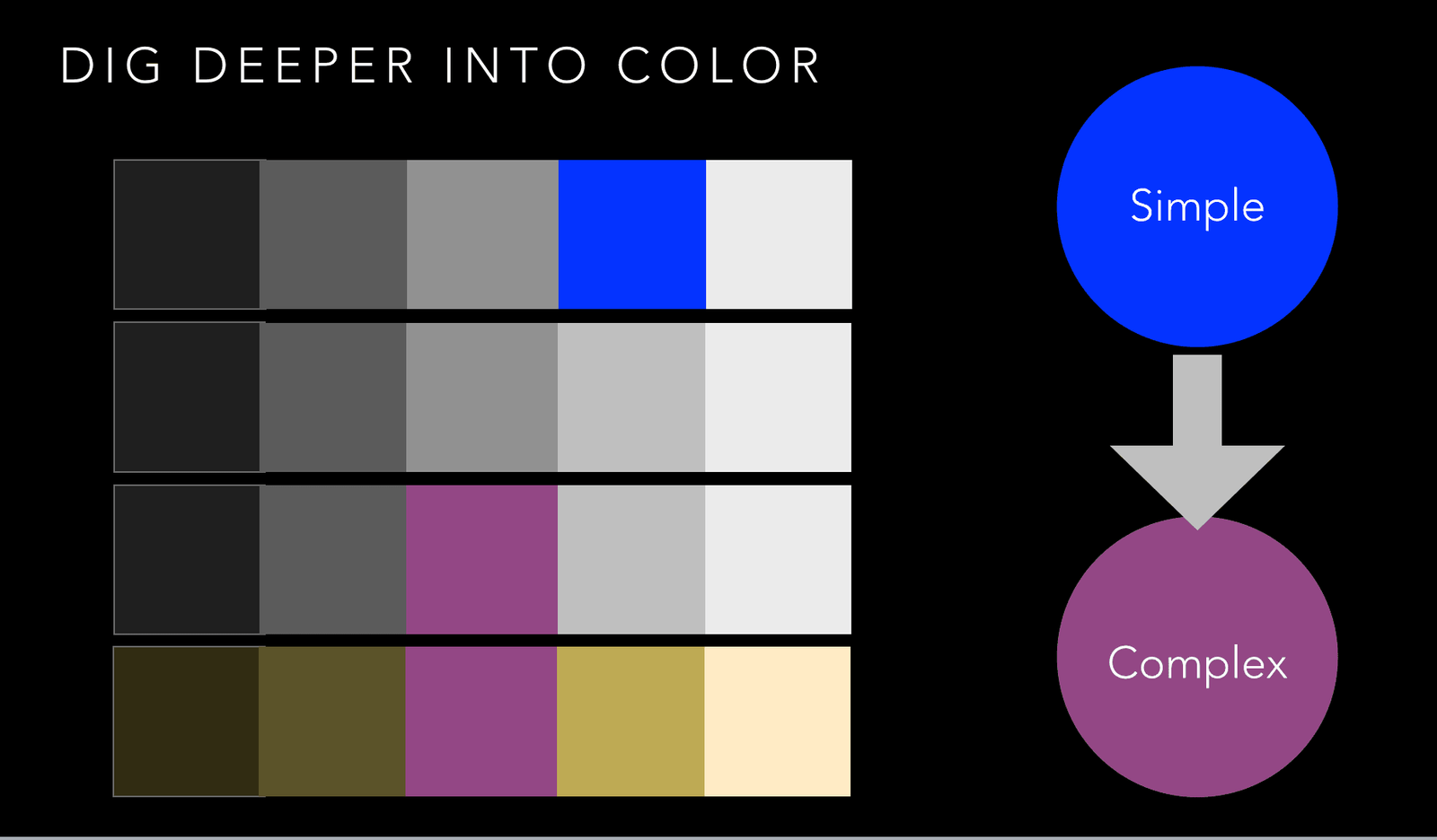
- The simpler/more basic the color the more casual message it sends. Facebook uses a very close to primary blue. To many people, it has come to represent “social apps.” Twitter uses a lighter, but still very friendly sky blue.
- The more complex, mixed from other colors it is, the more nuanced the meanings a color will have. Complex colors are pretty popular right now. You see them in interior and exterior wall colors, in clothing and accessories.
- New neutrals – not just gray, but other colors muted such as “military green”. These pair well with bright colors and look fresh. They also are great for supporting contrast on sites as a background or a text color.
- People don’t want their sites to change too much. The design challenge popular sites and brands have when they want to change any part of their look is the monetary impact that can have. People like the familiar. Coke did an amazing job of changing while referencing the rich history of the brand, largely in parts to the efforts of Moira Cullen, a brand strategist.
Now you have five tips for creating better color palettes for use on your next web or interactive project, whether it is an infographic or an app or a web site. Some of these tips may seem obvious, but they are the kinds of things designers have to remind themselves of. Just like everyone else, we can get caught up in a project and not see the trees for the forest or the bears. Did you find this helpful?
What other burning color palette questions do you have? Do you have a brand color that is challenging to work with or do you need to get out of a color rut?