It can be hard sometimes to choose the right color or set of colors for a project. Learning what different colors may mean to your audience and matching the right ones to the goals of your project takes research and careful thought. Different shades, tones and tints of the same color can have a very different impact. Today we will explore the Western meanings of eight common colors.
I was giving a talk about color theory at a local university to mobile app and web development students this week. They had a lot of great questions. Many of them had not really considered how making color theory and choosing colors for a project based on the emotional impact and meaning could support and add polish to their work. I did warn them and I am warning you all now that today I’m just talking about associations we tend to have with colors in Western European and popular culture. Even more specifically, these are tinged with US cultural bias. Considering the region and cultural perspective of the audience can make or break a project.
A few more notes about color that are important to know, especially if you are new to design:
- Color affects us subconsciously and consciously.
- Our associations with color are largely cultural and often unconsciously subjective, carefully research appropriate color meanings for international audiences.
- Color can evoke a time period, culture, location, memory, or feeling.
- People who are color blind see color differently, so CONTRAST is king.
- Your site, app or project should work without color. Color is supports the message and functionality. It should not have the starring role. Text and/or sensible icons should always be paired with color when it is part of an action, such as a “trash” screen or a button.
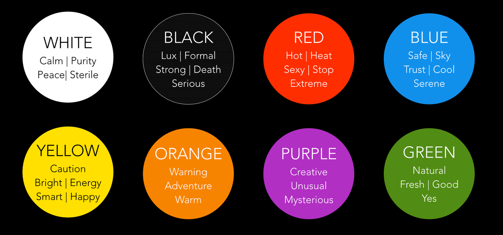
White
White is the absence of color in physical media and formats such as printing, but in the RGB spectrum white is all three colors (Red, Green and Blue) set to the value of 255. Now gaining popularity as an app background or overlay due to recent iOS updates, it typically evokes calm, serenity, peace and also, in a more negative way, sterility.
Black
Black is the absence of color in the RGB spectrum. Expensive cars and formal wear are often black, so it has become associated with formality and luxury. It also implies strength and serious thinking. It is also the color of rebellion when paired with leather textures or spiky hair. In the US and Europe, it is also a color associated with death. It supports the meaning of other colors, depending on what it is paired with. A traditional neutral, a more sophisticated way to use it is to mix it with an existing color to darken the tone, so the other color itself has more depth and interest.
Red
Used for stop lights and traffic stop signs, red is a funny mix of No! and Whoohoo! Seen on lips or clothing it is sexy. On a temperature or other gauge it indicates heat or a problem. It is an extreme color that demands attention, whether due to strong feelings of attraction or rage, or if there is a serious issue or warning to share.
Blue
This is the most popular color in web design. Depending on the tone or tint, it can mean sociable, friendly, safe, trustworthy, serene or cool. It reminds people of sky, vacations and thoughtfulness. Many businesses use various shades of blue, so it has a reputation as a “safe” choice. Blues based on colors found in bodies of water or the natural sky at different times of the day or year work great for soothing or optimistic themes. A light blue or a navy can be paired with a trendy or bright color and transform the mood of blue to something more fun or edgy.
Yellow
Happy, cautious, garish, fun, full of energy and smart, yellow almost sounds more like a puppy or toddler than a color. Bright yellow compared to a faded looking light yellow with a bit of brown has a very different mood. I personally like yellow best when it is made more complex by shifting the tone or tint or mixing it with other colors. Vivid yellows can be edgy, while more traditional yellows can remind people of school buses or police tape. Yellows with some orange or a little purple in them can add a lot of zest and interest to a design.
Orange
Orange is used for warning signs, construction and traffic cones in the US, but it also is used a lot in technology and home wares to imply a cool sense of adventure. It straddles the middle ground between yellow and red, so depending on how much of either it has can alter the mood it evokes. It also reminds us of fire, warmth, pumpkins, autumn leaves, harvest, and comfort.
Purple
A heady mix of red and blue and one of the most challenging colors to physically mix, purple has a quirky reputation. It has been used heavily in the gaming industry paired with green to create a mood of mystery and evil. It is often seen on book covers paired with pink or blue or smoky grays and blacks to support a mystery or urban fantasy theme. It used famously by Yahoo! It suggests the unusual, the strange, the mysterious. It is a daring color of creative people. It is traditionally the color of rulers and an expensive dye in ancient Rome and Greece. It can be luxurious or edgy depending on what else it is paired with or the tint and tonal value.
Green
Green has been a bit overused recently to represent natural, fresh or organic products. This past couple of years I am seeing more orange or browns replace green or being used with green as an accent in products or services that want to be seen as healthy or fresh. Green also can represent green traffic lights, success, money, finances and good things. Since a huge range of shades of green are found in nature, it is heavily used for food product packaging and outdoor services. Vibrant greens that are almost yellow or blue can be very edgy and a version of an almost neon green is part of the Pantone Spring 2016 color trend report. It livens up other colors when paired with them and can be very conservative, a great neutral when very dark or muddy and shocking when very bright.
New Color Trends
The renewed interest in handmade or crafted things has led to a shift in gentler colors that evoke a different time period or are drawn from nature or artisan tools. Pantone’s color forecast for Spring is focused on shades that work together to create feelings of optimism and thoughtfulness or reflection and are usable in unisex products. These colors work well with tans and other more earthy neutrals that are popular right now.
References:
www.thejlsagency.com/do-colors-affect-brands/
What do different colors mean to you? Do you like or dislike how color is being used on different app interfaces or websites today?