Taking the time to carefully consider what charts, graphs, or graphics will best represent your data will help you get the biggest impact for the story you are trying to tell. Here are ten tips based on my own experiences wrangling data.
Audit your data
Does some of it lend itself better to a certain type of data visualization technique? A stand out stat in a group of data might look best as a pie chart or illustration/icon. I’ve learned that stats that are 1/4 or larger in size tend to have the most impact. If there is not a lot of variation in the data sets, you might be able to group the data into sections. For example, if the percentages over different date ranges are very similar, what happens when you put everyone under or over 40 in one group?
Different charts and graphs tell the story
The planning you did initially really starts to show here. How you represent your data should help tell the story. Do you need highly detailed charts or easy to read pie charts, bar charts, and pictograms? Do you use a lot of the same type of chart or a mixture?
Curate the stats and data to best tell your story
Sometimes even if a stat seems exciting, if it doesn’t support the story, it is in your best interest to set it aside for another time.
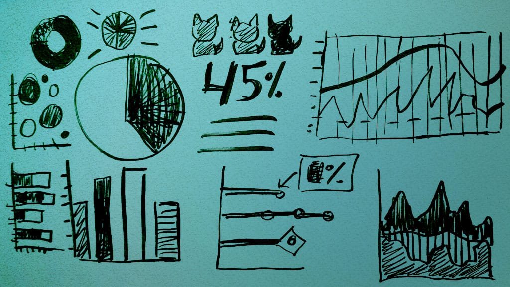
Pie charts are great for big differences in data
Showcasing a big stand out number is what pie charts excel at. You can use them to show other amounts of data too, but the more data items you add, the harder the details will be to see a smaller sizes without the ability to drill down.
Scatter plot charts are a different way to show data relationships with a variety of numbers
The variation in size can be an interesting way to tell the story. Instead of circles or squares, you can also use graphics of different sizes to represent the data points.
Line graphs are good at showing change over time
The best uses of line graphs in my experience are in situations where you have at least three things you are showing in relationship to each other over time. Examples would be different categories of marketing touch points, sales channels, or types of bakery goods sold in the past quarter.
Bar charts are good for comparing 3-7 data points
Bar charts are a more conservative way to compare multiple data points or statistics. You can even group sets of statistics together into a bar chart to emphasize a story point.
Use graphics to support your message and enhance your data
Illustrations & icons work best to add variety, a bit of fun, and to draw attention to data. They are very effective for data or statistics that might normally go in pie chart such as “One in Four”, 12 out of every 100 people.”
Use a variety of charts if you are stat/data heavy.
Break up the walls of data and text and monotony of one chart by finding ways to use pie charts, bar charts, and line graphs.
Don’t be afraid to use just one type if you want to use a lot of images and text or have a few stats to showcase.
Change up the scale of the charts
It is a good practice to either have all the charts/graphs the same size, or make some of them scaled to at least 33% or 66% in relationship to each other. You might have a showcase stat at the top or at a major flow point, and have a row of pie charts or bar graphs that are the same size in another section.
I hope you’ve found this helpful for your next infographic or data visualization project. Next week I’ll be discussing how to choose the right layout for your message.