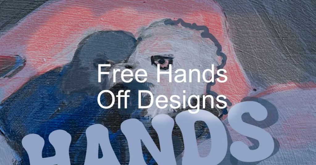
I’m continuing my series of colorful dog portraits with this friendly Boston Terrier. He was inspired by a conversation I had with a fellow designer at a conference. He was talking about how Boston Terriers are the ultimate pet for designers. They are a cute, quirky and visually appealing breed. They pack a lot of personality into a tiny body. This piece was made on high quality 140lb watercolor paper using watercolor washes and ink washes with layers of Derwent inktense block art sticks layered on top. And layered again. And again. There were a few chalk pastels used here and there, but yeah who uses ink medium for textured layers? It’s fun to experiment like this and not use art materials the way the were intended. I get a thrilling zing in my belly. Does this make me an…
Category: Color
Color Secrets: Vibrancy
Vibrancy is about how intense a color is, how strong the color appears to be. It is not just how bright or colorful it is, instead it is more about how pure and vivid the color is. Artists who use physical paints often use this term to describe how well a color matches the original paint out of a tube or to compare two colors next to each other. Digital artists and creatives also use vibrancy, usually as a way to compare an object’s color to a background or another element. Vibrancy can be good but also bad. Two strong colors like orange and blue hues tend to look like they are visually vibrating when they are next to each other. This is why people usually try to use a vivid color paired with a duller or desaturated color. Navy…
Color Secrets: Brightness
There has been a trend lately in app design where white or very light backgrounds are paired with minimal use of color and flat, simplified shapes. Why this shift when sites had been trending darker and darker? Is it the Star Wars reboot? A renewed interest in futurism? Or are we just all tired of looking at gray or black displays? As more and more sites provide lighter sites or options to choose what backgrounds we want, designers and user experience professionals will need to take another look at how people are using devices as part of their daily lives. People don’t use devices in well lit, climate controlled areas. Being able to observe and take into account the key environments where users are will then have an impact on choices about color including brightness, contrast and saturation. My personal ideas about why…
Five Quick Color Tips For Your Next Project
Many developers and designers I talk to are very frustrated when it comes time to pick colors for a project. It can be hard to choose the right color or set of colors for a project. I want to share with your five quick tips for using color in your next project so you can make the best user experience possible. (more…)
100 days seltzer bottle sketch
Created using the Adobe Draw app on my iPad for the 100 days project. I used mostly brushes 2 and 4 that come default with the app. You can follow my progress on Instagram. I wish the brush size controls were a bit easier to use. They do not all have the same size ranges. I would also like for larger sizes. I’m also still adjusting to the line weights of the different brushes. Sometimes they appear larger or smaller than I expect when I start using them. I used an Intuos Bamboo stylus since I was traveling and did not pack a full size stylus.
Five Tips for Creating Better Color Palettes for the Web
I’ve put together five tips for creating better color palettes based on a recent talk I gave to computer science students. Faced with working on their first mobile apps or sites, they had never really been given advice on choosing color palettes. I realized this is one of those gaps in knowledge; part of the missing manual of design experience you build over time as a developer or designer. I hope you find them useful too. (more…)
What Does That Color Mean?
It can be hard sometimes to choose the right color or set of colors for a project. Learning what different colors may mean to your audience and matching the right ones to the goals of your project takes research and careful thought. Different shades, tones and tints of the same color can have a very different impact. Today we will explore the Western meanings of eight common colors. (more…)
Sketch to Finished Graphics in a Day
I had a problem a lot of designers face. I spend so much time designing other people’s web sites and assorted miscellany that things like the design of my own site tend to fall to the wayside. I had a long weekend ahead of me and a fire in my belly after seeing some of the amazing designs of other people. It was time to take action. It began with a clean up of the overall layout and template of the site, but I was still lacking an awesome hero header for my home page. After some time spent thinking about what I do and what it means, I was ready to start concepting and sketching. The full case study is available in the new case study section of this site. You can see the end result on the home…
Finding Color Inspiration in Games
Sometimes we need a quick jolt of inspiration to get out of a color rut. I often hear from other designers that they use the same colors over and over again. There are perfectly good reasons why – we may be known for a certain color palette (Nubby and her black, white and reds), or be restricted by brand guidelines or we just gravitate to some colors. While constraints are great, pushing ourselves progressively as creatives means going outside our comfort zones and also challenging standards. Color is a great way to alter mood, focus, and revitalize. Today I’m taking a quick look at three sources of color inspiration with a gaming theme. (more…)
Secrets to Color Matching Monitors and Printers
I was recently asked how a designer can make sure the colors on the screen and the colors on the printer are the same. The hard and short answer is a glowing screen and a printed piece of paper will never look quite the same. They are two different mediums. If you look around you on a typical day, you will also notice lit up signage, billboards, vehicles, packaging, and clothing. Many of those are also produced using a color match system. If you take one color, even a color system matched color, it will not look exactly the same to the naked eye across difference materials. (more…)
Testing Color Theme Tools and Getting Out of a Color Rut
I asked other designers what they were struggling with when it came time to pick a color theme. They gave me a wide range of answers, some about how easy it is to fall into a color rut, while others tend to browse colors and hope for the best. Others mentioned struggling with issues of contrast. These are all challenges we face as creative people. Asking ourselves the right questions and honing our eye for color can help us overcome them and be more effective with our designs. (more…)